
Mobile-First Ecommerce Website Development: Complete Guide for 2026
Dipti Singhal
Jun 09, 2026

When people have a bad experience on your site, they usually leave without buying anything. That’s lost sales, plain and simple. But if you focus on your customers and shape every detail around what they need, you don’t just make sales; you earn their loyalty.
Now, think about how things have changed. These days, you can order groceries, book a cab, or shop for clothes without ever leaving your couch all with a few taps on your phone.
Mobile shopping is exploding, and it’s only going to get bigger. Building a mobile eCommerce site basically puts your whole store right in someone’s pocket.
In this blog, we’ll dive into how to create standout customer experiences with a mobile-first, responsive design. We’ll break down how to do it and why it works and share the best tips to make it a success.
What Is Mobile-First Ecommerce Website Development and Why Does It Matter?
Mobile-first ecommerce website development is initially designed for mobile devices that are frequently adapted for bigger screens for developers. This innovative kind of approach is basically adopted and can allow designers to streamline the content to optimize for building an attractive user interface.
You don’t even need to know how to code or have any other skills to build these kinds of experiences today. You just need to contact an ecommerce website development company to get started with the mobile-first approach and improve your platform.
Top Benefits of Building a Mobile-First Ecommerce Website
One of the best advantages of mobile-first design is that it can avoid the problems that are often associated with lesser accessibility for desktop-first approaches. In case your business is still resistant, it can adopt a mobile-first strategy. Here are some benefits of mobile-first ecommerce website development.
Search Engine Optimization Thrives
The major factor behind a website’s SEO grade will be adaptive mobile design. In current situation, the most popular search engines like Google are practicing mobile-first indexing policies. It can imply that not having a mobile-friendly website will cause a drop in search listings frequently.
Responsive for All Platform
It is one of the major advantages of mobile-first e-commerce websites that are convenient for any platform. Your website would be accessible by your users through smartphones as well, and it can provide the same results for desktop users as well.
Seamless User Experience
Mobile UX ecommerce is one of the main aspects that you would consider in mobile-first ecommerce website development. Improvement in user experience will provide loyalty to your shoppers. This can enhance the customer retention rate along with the trust of your users in the business.
Well-Structed Information
Mobile websites rely heavily on content; there really is no need for other filler text. The restricted space available can only take up valuable space with useful content that will direct the customers through the buying process. It is also far easier to read on a mobile phone, as authors usually break their work up into two or three-sentence paragraphs.
Step-by-Step Process to Build a Mobile-First Ecommerce Website
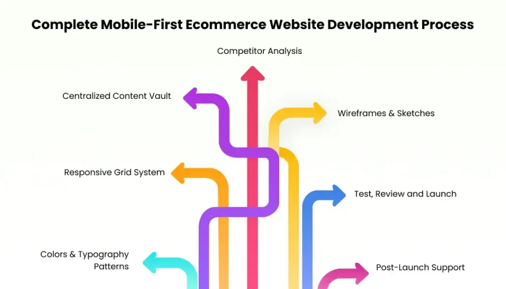
It’s time to do some discussion on the step-by-step development process to build a ecommerce website that will stand out from the crowd:
Competitor Analysis
Doing competition research is important to get insights about market trends & strategies. It is essential to understand about the competition that can provide an idea to build strategies according to the market demand. Competitor analysis for a website includes competition in different ways for layout, CTA placements, and navigation.
Centralized Content Vault
The mobile ecommerce website involves huge amounts of data. It majorly includes data such as product details, transaction history, customer information, and so on in ecommerce web design services. It also organizes the data in a single location, which is important for businesses to build a single, but reliable, source. By centralizing the data, businesses can also ensure that there is one major source of information that can prevent data inconsistencies or conflicting information.
Wireframes & Sketches
Sketches and wireframes are important elements for visual references and major guides for developers during the presentation implementation process of the ecommerce mobile website. It can provide a sorted blueprint for the functionality and structure of the website.
You can hire ecommerce web developers in India that define the replacement of features, menus, buttons, and content areas. It also helps developers, designers, stakeholders, and clients to understand the design of the website.
Responsive Grid System
In the digital landscape, people access websites on different devices like mobile phones, tablets, and desktops in shopping website development solutions. A responsive grid system can also allow the mobile-first ecommerce website layout to check the look on different digital devices in online store development. A responsive grid system also ensures a mobile-first ecommerce website for multiple devices.
Colors & Typography Patterns
The next step is selecting the typography and colors for a mobile ecommerce website. The brands can also choose the legible fonts to build a coherent color system. The fonts should be easily readable for mobile screens in ecommerce website . The color combination will look good on diverse digital layouts to maintain consistency and monotony.
Test, Review and Launch
After creating a proper structure and layout, the next step is to test, review, and launch the mobile-first ecommerce website.
- Test—It majorly involves conducting tests through multiple digital devices to make sure that the website works well for every device.
- Review—The review stage basically involves taking feedback and reviews from different people like clients, stakeholders, and developers.
- Launch—After testing and review stages, the website is ready to go live on social platforms.
Post-Launch Support
The process doesn’t stop here. After launching a website, it is also important to monitor the performance and understand the user behavior to identify any issue and make informed decisions for enhancements.
Key Features of a High-Converting Mobile Store
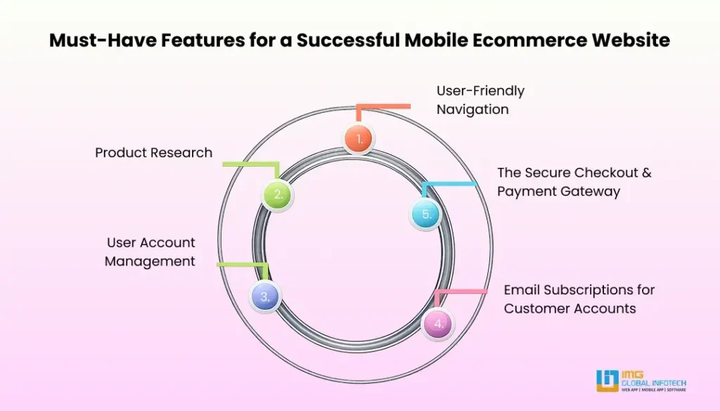
Mostly shoppers browse and swipe through phones. That’s why most of the traffic for online shopping platforms is generated through mobile apps. The users always expect clarity, speed, and trust, and the same goes for search engines. Here are some key features that can enhance the performance of your mobile-first ecommerce website.
User-Friendly Navigation
Mostly ecommerce businesses fail in the initial years for launch. The main reason is poor design that disappoints users for ecommerce solutions. It mainly includes clear menus, simple product paths, and logical categories, which are crucial for ecommerce websites.
Product Research
A strong internal search system that helps users to search their products faster in ecommerce development services. The personalized recommendations that showcase the recently viewed products make the shopping experience feel interesting. It can also improve the shopping experience for users.
User Account Management
The user accounts help to make online shopping easier. This feature can also save customer details like past orders, addresses, or preferred products in mobile-first ecommerce website development. This can also allow suggesting relevant items to make useful updates for restocks and order statuses.
Email Subscriptions for Customer Accounts
There is ease for customer accounts for reordering the products to enhance retention in mobile ecommerce development. Email subscriptions always help to stay connected with users, which brings them back into the website to drive high traffic in the business operations.
The Secure Checkout & Payment Gateway
Most businesses lost customer trust after a serious data breach, and of that, 38% of cyberattacks were aimed at commerce websites. It is no wonder shoppers want to feel secure submitting credit card details on a mobile-friendly e-commerce website. HTTPS, reliable payment gateways, and a seamless checkout flow assist shoppers here.
Common Mobile Ecommerce Mistakes That Drive Customers Away
Many mobile-first ecommerce websites struggle with performance just because of avoidable design mistakes. Let’s take a closer look at that problem once:
- Slow Loading Pages
- Rigid Checkout Forms
- Minor Buttons and Clickable Elements
- Unoptimized Product Pictures
- Confusing Navigation Menus
Basically, these problems will create friction for users that can also reduce conversion rates. Businesses that emphasize mobile-first ecommerce design have to avoid these problems to deliver a seamless user experience.
Real-World Examples and Best Practices From Successful Mobile-First Brands
Let’s take a look at how major ecommerce brands have benefited from mobile-first strategies:
ASOS (UK-Based Fashion E-commerce)
Challenge: Irregularity in mobile UX with low app downloads.
Solution: Redesign the website by integrating mobile-first design with impactful features.
Results:
- Increment in Mobile Orders
- Enhance Bounce Rate
- Massive Boost in App Engagement
Also Read – How To Build A Fashion App Like ASOS – Complete Guide 2026
Zara
Challenge: Slow mobile navigation with messy product displays.
Solution: Introduced mobile-first responsive layout with faster product filtering.
Results:
- Increment in Total Sales
- Enhancement in Sales on Product Bundles
Also Read – Build An Ecommerce Fashion App Like Zara: A Step-by-Step Guide
Myntra
Challenge: Huge traffic from mobile but low engagement and major issue in cart size.
Solution: Build an app for a mobile web interface integrated with AI-powered recommendations.
Results:
- Twice Growth in Average Session Time
- Rise in Average Cart Value
- Better Storytelling Concept of Mobile-Foucsed Content
Flipkart
Challenge: High cart withdrawal rates and clunky mobile website.
Solution: Launched a PWA (Progressive Web App) with mobile-first performance optimization for simplifying checkout.
Results:
- Expansion in Conversions
- 3x Lower Data Usage
- Higher Engagement via Push Notifications
Also Read – How Much Does Flipkart Like App Development Cost?
Let’s move on to some best practices for mobile-first ecommerce website development to start an ecommerce buisness:
Make Your Site Fast
Speed matters more than anything when it comes to mobile. Over half the people who show up expect your page to load in three seconds or less. If it doesn’t, they’ll just bail.
Space Efficiency
You see some mobile sites try to cram in way too much info, and it turns into a crowded mess. The trick is to keep things simple. Prioritize what actually matters and don’t overload the layout.
Enable Touch Interactions
You have to think differently on a mobile shopping website. Swiping and tapping feels nothing like pointing and clicking with a mouse. Build your interface so it makes sense for fingers, not just clicks.
Minimize the Text Inputs
Typing on a phone feels clumsy in mobile commerce solutions. Skip text fields when you can. If you need users to type something, use autocomplete or auto-suggest tools to make it as painless as possible.
The Future of Ecommerce: Why Mobile-First Development Is No Longer Optional
Cutting-edge technologies are developing, such as artificial intelligence (AI), augmented reality (AR), and voice search, to contribute to the mobile shopping experiences in the future from a comprehensive ecommerce web development company. AI allows consumers to get personalized product suggestions, and chatbots help consumers to make quick purchasing decisions.
Through the AR function, customers can have virtual tries in wearing clothes, accessories, or furniture before adding them to the cart, therefore increasing customers’ purchasing desire in mobile-first web design. It is easy for consumers to order whatever they want in their hands since they are using digital assistants to complete fast orders by voice search.
Final Thoughts
Through this blog, we have discussed mobile-first ecommerce website development in a detailed way. We have also discussed some important topics in this blog, like the importance of mobile-first ecommerce websites, benefits, development processes, key features, common mistakes, real-world examples, best practices, and the future of e-commerce.
So if you are planning for an online store through mobile-first ecommerce development, then you can partner with a trusted ecommerce web development company in India like IMG Global Infotech. Our experts are always here to build creative and innovative solutions that can not only enhance the brand image but also generate higher revenue in the business.
 Add us as a preferred source on Google
Dipti Singhal is a skilled Content Writing Specialist at IMG Global Infotech, with strong expertise in creating engaging, SEO-optimized content for various industries. She focuses on blending storytelling with effective keyword strategies to help businesses connect with their audience and improve their online visibility. Passionate about delivering high-quality content that drives real results, Dipti plays an essential role in strengthening the company’s digital presence.

Changes in consumer behavior and preferences have brought about growth in the home decor sector. Home decor e-commerce m...
Written by
Lokesh Saini

Learn how jewellery app development works in 2026, from planning and essential features to technology, development costs...
Written by
Dipti Singhal

Learn the custom fashion ecommerce website development cost in 2026. Understand pricing, key features, and factors that ...
Written by
Lokesh Saini

Learn how AI Agents in Fintech are driving the future of banking with emerging trends, business benefits, challenges, an...
Written by
Mohit Mittal

Learn the cost of building a mobile app in India for startups, including key factors that affect pricing and smart budge...
Written by
Lokesh Saini

Learn how to build an Agentic Ecommerce Store with WooCommerce. Explore core technologies, AI use cases, development cos...
Written by
Dipti Singhal


